Lazada Malaysia

Currency BUY/SELL volume

InstaForex is an universal Forex portal for traders

Pivot Point Levels

Pivot Point Levels

FOREX LIVE CHART

On-line Forex Chart

Language Translate

Forex Brokers IKOFX


Forex Brokers: IKOFX

About IKOFX:
IKOFX has been established for the purpose to help Investor in success of Forex. With the help of latest news feed, and world wide information gathering, IKOFX is aimed to bring online forex trading to the next higher level. During hash time of current economy downfall, forex trading is what the world most needed to boost up the economy.

The IKOFX Company provides services for currency trading on the international financial Forex market. The company's main working directions are: providing qualified investment services aimed at earning speculative profit on international financial trading markets. IKOFX had operating experience and distribute among Asia countries and Middle-east countries. Currently, there are about a thousand of traders are using our services provided.


Website Link :

Country :Cyprus
Regulation :CySEC - Cyprus Securities and Exchange Commission
Introducing Broker (IB) :Yes
Dealing Desk :Market Maker (MM)
Trading Platform(s) :MetaTrader 4 (MT4)
Mobile Trading :Yes
Pairs Offered 23:


Type of Spread :Fixed
Commission / Fee :No
Maximum Leverage :500:1 (0.2%)
Free Demo Accounts :Yes
Minimum Initial Deposit - Mini US $1
Minimum Initial Deposit - Standard US $2,000
Multi-Currency Accounts USD - US Dollar
Smallest Lot Size :100
Swap Free Accounts: Yes
Account Funding Methods :Wire • Liberty Reserve • Local Depositor
Scalping: Yes
Hedging: Yes
Gold Trading: Yes
Silver Trading: Yes
Live Chat: Yes
Languages: English


WELCOME BONUS
Every client has a right to receive the Welcome Bonus in the amount of 20 USD/50 USD/100 USD/500 USD to his trading account in case initial deposit balance of a trading account is as following:


* 1 standard lot is equivalent to 10 mini lots.
* example: deposit USD100 you will get USD20 bonus , but cant withdraw the bonus, you must trade up 10 standart lot= USD10 so you can withdraw your bonus now,if not just only can withdraw your USD100 only.


Why Trader Trade in IKOFX:

  • Minimum Deposit as low as USD 1
  • Commissions-Free Trading
  • Instant Orders Execution
  • Flexible Leverage Up to 1:500
  • Swap-Free Accounts
  • Competitive Dealing Spreads as Low as 2 Pips

(Local deposit & withdraw not any charges)


(JOIN NOW COMMISSION FREE AND EVERY TRADE GET 20% REFUND)


FOREX PRICE Daily High / Low


Daily High / Low


Forex Quote Tables


Forex Quote Tables


MACD

MACD

is an acronym for Moving Average Convergence Divergence. This tool is used to identify moving averages that are indicating a new trend, whether it’s bullish or bearish. After all, our #1 priority in trading is being able to find a trend, because that is where the most money is made.


With an MACD chart, you will usually see three numbers that are used for its settings.


  • The first is the number of periods that is used to calculate the faster moving average.
  • The second is the number of periods that are used in the slower moving average.
  • And the third is the number of bars that is used to calculate the moving average of the difference between the faster and slower moving averages.

For example, if you were to see “12,26,9” as the MACD parameters (which is usually the default setting for most charting packages), this is how you would interpret it:

  • The 12 represents the previous 12 bars of the faster moving average.
  • The 26 represents the previous 26 bars of the slower moving average.
  • The 9 represents the previous 9 bars of the difference between the two moving averages. This is plotted by vertical lines called a histogram (The blue lines in the chart above).

There is a common misconception when it comes to the lines of the MACD. The two lines that are drawn are NOT moving averages of the price. Instead, they are the moving averages of the DIFFERENCE between two moving averages.

In our example above, the faster moving average is the moving average of the difference between the 12 and 26 period moving averages. The slower moving average plots the average of the previous MACD line. Once again, from our example above, this would be a 9 period moving average.

This means that we are taking the average of the last 9 periods of the faster MACD line, and plotting it as our “slower” moving average. What this does is it smoothes out the original line even more, which gives us a more accurate line.

The histogram simply plots the difference between the fast and slow moving average. If you look at our original chart, you can see that as the two moving averages separate, the histogram gets bigger. This is called divergence, because the faster moving average is “diverging” or moving away from the slower moving average.

As the moving averages get closer to each other, the histogram gets smaller. This is called convergence because the faster moving average is “converging” or getting closer to the slower moving average. And that, my friend, is how you get the name, Moving Average Convergence Divergence! Whew, we need to crack our knuckles after that one!

Ok, so now you know what MACD does. Now I’ll show you what MACD can do for YOU.


MACD Crossover

Because there are two moving averages with different “speeds”, the faster one will obviously be quicker to react to price movement than the slower one. When a new trend occurs, the fast line will react first and eventually cross the slower line. When this “crossover” occurs, and the fast line starts to “diverge” or move away from the slower line, it often indicates that a new trend has formed.


From the chart above, you can see that the fast line crossed under the slow line and correctly identified a new downtrend. Notice that when the lines crossed, the histogram temporarily disappears. This is because the difference between the lines at the time of the cross is 0. As the downtrend begins and the fast line diverges away from the slow line, the histogram gets bigger, which is good indication of a strong trend.

There is one drawback to MACD. Naturally, moving averages tend to lag behind price. After all, it's just an average of historical prices. Since the MACD represents moving averages of other moving averages and is smoothed out by another moving average, you can imagine that there is quite a bit of lag. However, it is still one of the most favored tools by many traders.


Bollinger Bands

Bollinger Bands

Bollinger bands are used to measure a market’s volatility. Basically, this little tool tells us whether the market is quiet or whether the market is LOUD! When the market is quiet, the bands contract; and when the market is LOUD, the bands expand. Notice on the chart below that when the price was quiet, the bands were close together, but when the price moved up, the bands spread apart.


That’s all there is to it. Yes, we could go on and bore you by going into the history of the Bollinger band, how it is calculated, the mathematical formulas behind it, and so on and so forth, but we really didn’t feel like typing it all out.

In all honesty, you don’t need to know any of that junk. We think it’s more important that we show you some ways you can apply the Bollinger bands to your trading.

Note: If you really want to learn about the calculations of a Bollinger band, then you can go to
www.bollingerbands.com


The Bollinger Bounce

One thing you should know about Bollinger Bands is that price tends to return to the middle of the bands. That is the whole idea behind the Bollinger bounce (smart, huh?). If this is the case, then by looking at the chart below, can you tell us where the price might go next?


If you said down, then you are correct! As you can see, the price settled back down towards the middle area of the bands.


That’s all there is to it. What you just saw was a classic Bollinger bounce. The reason these bounces occur is because Bollinger Bands act like mini support and resistance levels. The longer the time frame you are in, the stronger these bands are. Many traders have developed systems that thrive on these bounces, and this strategy is best used when the market is ranging and there is no clear trend.


Bollinger Squeeze

The Bollinger squeeze is pretty self explanatory. When the bands “squeeze” together, it usually means that a breakout is going to occur. If the candles start to break out above the top band, then the move will usually continue to go up. If the candles start to break out below the lower band, then the move will usually continue to go down.


Looking at the chart above, you can see the bands squeezing together. The price has just started to break out of the top band. Based on this information, where do you think the price will go?


If you said up, you are correct! This is how a typical Bollinger Squeeze works. This strategy is designed for you to catch a move as early as possible. Setups like these don’t occur everyday, but you can probably spot them a few times a week if you are looking at a 15 minute chart.

So now you know what Bollinger Bands are, and you know how to use them. There are many other things you can do with Bollinger Bands, but these are the 2 most common strategies associated with them. So now you can put this in your trader’s toolbox, and we can move on to the next indicator.

Moving Average

Price Smoothies

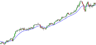
A moving average is simply a way to smooth out price action over time. By “moving average”, we mean that you are taking the average closing price of a currency for the last ‘X’ number of periods.


Like every indicator, a moving average indicator is used to help us forecast future prices. By looking at the slope of the moving average, you can make general predictions as to where the price will go.

As we said, moving averages smooth out price action. There are different types of moving averages, and each of them has their own level of “smoothness”. Generally, the smoother the moving average, the slower it is to react to the price movement. The choppier the moving average, the quicker it is to react to the price movement.

We’ll explain the pros and cons of each type a little later, but for now let’s look at the different types of moving averages and how they are calculated.


Simple Moving Average

A simple moving average is the simplest type of moving average (DUH!). Basically, a simple moving average is calculated by adding up the last “X” period’s closing prices and then dividing that number by X. Confused??? Allow me to clarify. If you plotted a 5 period simple moving average on a 1 hour chart, you would add up the closing prices for the last 5 hours, and then divide that number by 5. Voila! You have your simple moving average. If you were to plot a 5 period simple moving average on a 10 minute chart, you would add up the closing prices of the last 50 minutes and then divide that number by 5. If you were to plot a 5 period simple moving average on a 30 minute chart, you would add up the closing prices of the last 150 minutes and then divide that number by 5. If you were to plot the 5 period simple moving average on the a 4 hr. chart…..OK OK, I think you get the picture! Let’s move on. Most charting packages will do all the calculations for you. The reason we just bored you (yawn!) with how to calculate a simple moving average is because it is important that you understand how the moving averages are calculated. If you understand how each moving average is calculated, you can make your own decision as to which type is better for you. Just like any indicator out there, moving averages operate with a delay. Because you are taking the averages of the price, you are really only seeing a “forecast” of the future price and not a concrete view of the future. Disclaimer: Moving averages will not turn you into Ms. Cleo the psychic!


Here is an example of how moving averages smooth out the price action.

On the previous chart, you can see 3 different SMAs. As you can see, the longer the SMA period is, the more it lags behind the price. Notice how the 62 SMA is farther away from the current price than the 30 and 5 SMA. This is because with the 62 SMA, you are adding up the closing prices of the last 62 periods and dividing it by 62. The higher the number period you use, the slower it is to react to the price movement.

The SMA’s in this chart show you the overall sentiment of the market at this point in time. Instead of just looking at the current price of the market, the moving averages give us a broader view, and we can now make a general prediction of its future price.


Exponential Moving Average

Exponential Moving Average (EMA)
Although the simple moving average is a great tool, there is one major flaw associated with it. Simple moving averages are very susceptible to spikes. Let me show you an example of what I mean:

Let’s say we plot a 5 period SMA on the daily chart of the EUR/USD and the closing prices for the last 5 days are as follows:

Day 1: 1.2345
Day 2: 1.2350
Day 3: 1.2360
Day 4: 1.2365
Day 5: 1.2370

The simple moving average would be calculated as
(1.2345+1.2350+1.2360+1.2365+1.2370)/5= 1.2358

Simple enough right?

Well what if Day 2’s price was 1.2300? The result of the simple moving average would be a lot lower and it would give you the notion that the price was actually going down, when in reality, Day 2 could have just been a one time event (maybe interest rates decreasing).

The point I’m trying to make is that sometimes the simple moving average might be too simple. If only there was a way that you could filter out these spikes so that you wouldn’t get the wrong idea. Hmmmm…I wonder….Wait a minute……Yep, there is a way!

It’s called the Exponential Moving Average!

Exponential moving averages (EMA) give more weight to the most recent periods. In our example above, the EMA would put more weight on Days 3-5, which means that the spike on Day 2 would be of lesser value and wouldn’t affect the moving average as much. What this does is it puts more emphasis on what traders are doing NOW.


When trading, it is far more important to see what traders are doing now rather than what they did last week or last month.


SMA vs. EMA

Which is better: Simple or Exponential?
First, let’s start with an exponential moving average. When you want a moving average that will respond to the price action rather quickly, then a short period EMA is the best way to go. These can help you catch trends very early, which will result in higher profit. In fact, the earlier you catch a trend, the longer you can ride it and rake in those profits!

The downside to the choppy moving average is that you might get faked out. Because the moving average responds so quickly to the price, you might think a trend is forming when in actuality; it could just be a price spike.

With a simple moving average, the opposite is true. When you want a moving average that is smoother and slower to respond to price action, then a longer period SMA is the best way to go.

Although it is slow to respond to the price action, it will save you from many fake outs. The downside is that it might delay you too long, and you might miss out on a good trade.


SMA
Displays a smooth chart, which eliminates most fakeouts.
Slow moving, which may cause a lag in buying and selling signals.
EMA
Quick moving, and is good at showing recent price swings.
More prone to cause fakeouts and give errant signals.


Pros:
Displays a smooth chart, which eliminates most fakeouts.
Quick moving, and is good at showing recent price swings.
Cons:
Slow moving, which may cause a lag in buying and selling signals.
More prone to cause fakeouts and give errant signals.


So which one is better? It’s really up to you to decide. Many traders plot several different moving averages to give them both sides of the story. They might use a longer period simple moving average to find out what the overall trend is, and then use a shorter period exponential moving average to find a good time to enter a trade.


In fact, many trading systems are built around what is called “Moving Average Crossovers”. Later in this course, we will give you an example of how you can use moving averages as part of your trading system.

Time for recess! Go find a chart and start playing with some moving averages. Try out different types and look at different periods. In time, you will find out which moving averages work best for you. Class dismissed!


Summary

•A moving average is a way to smooth out price action.
•There are many types of moving averages. The 2 most common types are: Simple Moving Average and Exponential Moving Average.
•Simple moving averages are the simplest form of moving averages, but they are susceptible to spikes.
•Exponential moving averages put more weight to recent prices and therefore show us what traders are doing now.
•It is much more important to know what traders are doing now than to see what they did last week or last month.
•Simple moving averages are smoother than Exponential moving averages.
•Longer period moving averages are smoother than shorter period moving averages.
•Choppy moving averages are quicker to respond to price action and can catch trends early. However, because of their quick reaction, they are susceptible to spikes and can fake you out.
•Smooth moving averages are slower to respond to price action but will save you from spikes and fake outs. However, because of their slow reaction, they can delay you from taking a trade and may cause you to miss some good opportunities.
•The best way to use moving averages is to plot different types on a chart so that you can see both long term movement and short term movement.

Support and Resistance Learrning


Look at the diagram above. As you can see, this zigzag pattern is making its way up (bull market). When the market moves up and then pulls back, the highest point reached before it pulled back is now resistance.

As the market continues up again, the lowest point reached before it started back is now support. In this way resistance and support are continually formed as the market oscillates over time. The reverse of course is true of the downtrend.


Plotting Support and Resistance


One thing to remember is that support and resistance levels are not exact numbers. Often times you will see a support or resistance level that appears broken, but soon after find out that the market was just testing it. With candlestick charts, these "tests" of support and resistance are usually represented by the candlestick shadows.


Notice how the shadows of the candles tested the 2500 resistance level. At those times it seemed like the market was "breaking" resistance. However, in hindsight we can see that the market was merely testing that level.


(If the pictures too small please click the pictures)


So how do we truly know if support or resistance is broken?

There is no definite answer to this question. Some argue that a support or resistance level is broken if the market can actually close past that level. However, you will find that this is not always the case. Let's take our same example from above and see what happened when the price actually closed past the 2500 resistance level.
In this case, the price had closed twice above the 2500 resistance level but both times ended up falling back down below it. If you had believed that these were real breakouts and bought this pair, you would've been seriously hurtin! Looking at the chart now, you can visually see and come to the conclusion that the resistance was not actually broken; and that it is still very much in tact and now even stronger. So to help you filter out these false breakouts, you should think of support and resistance more of as "zones" rather than concrete numbers. One way to help you find these zones is to plot support and resistance on a line chart rather than a candlestick chart. The reason is that line charts only show you the closing price while candlesticks add the extreme highs and lows to the picture. These highs and lows can be misleading because often times they are just the "knee-jerk" reactions of the market. It's like when someone is doing something really strange, but when asked about it, they simply reply, "Sorry, it's just a reflex."

When plotting support and resistance, you don't want the reflexes of the market. You only want to plot its intentional movements.


(If the pictures too small please click the pictures)


  • When the market passes through resistance, that resistance now becomes support.
  • The more often price tests a level of resistance or support without breaking it the stronger the area of resistance or support is.


Trend Lines

(If the pictures too small please click the pictures)


  • Trend lines are probably the most common form of technical analysis used today. They are probably one of the most underutilized as well.

  • If drawn correctly, they can be as accurate as any other method. Unfortunately, most traders don't draw them correctly or they try to make the line fit the market instead of the other way around.

  • In their most basic form, an uptrend line is drawn along the bottom of easily identifiable support areas (valleys). In a downtrend, the trend line is drawn along the top of easily identifiable resistance areas (peaks).

Candlesticks Learning


Candlesticks are formed using the open, high, low and close.


  • If the close is above the open, then a hollow candlestick (usually displayed as white) is drawn.
  • If the close is below the open, then a filled candlestick (usually displayed as black) is drawn.
  • The hollow or filled section of the candlestick is called the “real body” or body.
  • The thin lines poking above and below the body display the high/low range and are called shadows.
  • The top of the upper shadow is the “high”.
  • The bottom of the lower shadow is the “low”.

Foreign Exchange Learning

The Foreign Exchange Market:

The Foreign Exchange Market goes by many names - Currency Exchange, Foreign Exchange, Forex, FX-but no matter the term, it is simply the trading of one currency against another. Currencies are traded in the form of currency pairs with pricing based on exchange rates and spreads established by participants in the forex market.


Forex Market Size
:

The FX market has become the world's largest financial market, and it is about USD 3 trillion traded each day. Even combining the US bond and equity markets, total daily volumes still do not come close to the values traded on the currency market.


The Most Commonly Traded Currencies:

The sheer volume of trading completed every day in the FX market makes it by far the most liquid and most efficient market available. Because of the magnitude of the volumes traded, it is virtually impossible for individuals or companies to influence the exchange rate of the more commonly-traded currencies through any form of open market operations. No single individual has the resources required to manipulate pricing through targeted buying or selling on the market.
There are many currencies which you can trade and IKOFX currently supports up to sixteen currencies pairs and gold commodity market. The vast majority of trades however consist of pairs involving just these seven currencies:


Buying and Selling:

Buying a currency pair implies buying (longing) the first (base) currency and selling (shorting) an equivalent amount of the second (quote) currency to pay for the base currency. For example, buying EUR/USD means that you are buying Euros (EUR) using US Dollars (USD).

A speculator buys a currency pair if she believes the exchange rate for the base currency will go up relative to that for the quote currency (that is, the value of the pair will go up).


Selling the currency pair implies selling (shorting) the first (base) currency and buying (longing) an equivalent amount of the second (quote) currency to buy the base currency. For example, selling EUR/USD means that you are buying US Dollars (USD) using Euros (EUR).

A speculator sells a currency pair if she believes the base currency will go down relative to the quote currency, or equivalently, that the quote currency will go up relative to the base currency.


Placing an Order:

When you request to buy or sell a currency pair, you place an order (also known as "opening a trade") so that you "take a position" based on the exchange rate at the time. Right after you place an order, the value of the position will be close to zero, because the value of the base currency is more or less equal to the value of the equivalent amount of the quote currency. (In fact, the value will be slightly negative, because of the spread involved.)

As time goes on and exchange rates change, the value of the position will evolve to be profitable (or not). When you eventually decide to take a profit or stop a loss on the position, you "close" the trade. When you close the trade, Profit/Loss is calculated from the difference between the exchange rate at the time you opened the trade to the time you closed it.


Examples:
Suppose EUR/USD = 1.5000 and you sell 10,000:
• Your base currency position is 10,000 EUR
• Your quote or counter currency position is 10,000*1.5000=15,000.00 USD


Placing Orders:
To take advantage of perceived market movements, you place an order to either short or long a currency pair . This opens a new position (or trade) that can later be closed to either take profit or stop loss. Orders can be closed manually at any time, or automatically by a stop-loss or take-profit order.


Types of Orders for New Positions:
There are four types of orders you can place to open new positions (trades):

Market orders open a position immediately at the current market rates.

Limit orders open a position at some point in the future should a currency pair reach a specified threshold. There's a specified expiry date when, if the threshold wasn't reached, the order is closed and no position is opened.

Take-Profit orders clear a position by buying (or selling) the currency pair of the position when the exchange rate reaches a specified threshold. Take-Profit orders are typically used to lock in a profit.

For example, if you are long USD/JPY at 118.48 and believe the price will continue to rise until it reaches 120.00 but are unsure what it will do past 120.00, placing a Take-Profit at 120.00 will automatically close your position around 120 (should the market reach that rate) to lock in your profit.

Stop-Loss orders clear a position by buying (or selling) the currency pair of the position when the exchange rate reaches a specified threshold. Stop-Loss orders are typically used to limit losses and quantify risk.

For example, if you are long USD/JPY at 118.48 and set a Stop-Loss at 117, your position will automatically be closed around 117 and you will be protected from a further price decline.

Stop-Loss orders allow you a certain level of comfort when leaving a position open while you are away from your computer and not actively following the markets.


Margin Calculations:

To ensure that the speculator can carry the risk in the case where the position results in a loss, banks or dealers typically require sufficient collateral to cover those losses. This collateral is typically referred to as margin.

Sample Calculation:
The term Net Asset Value represents the current value of your account. It includes your account balance as well as all unrealized profit and losses associated with your open positions. If you were to liquidate your account by closing all positions and withdrawing all your funds, then the Net Asset Value indicates what that amount would be.

If you have no open positions, then the Net Asset Value is simply equal to your Account Balance. (The Account Balance is equal to all of the funds ever deposited into your Account, minus all of the funds ever withdrawn from your Account, adjusted for interest and any profits or losses that have been realized through trading).

If you have open positions then it gets just a bit more involved. The Net Asset Value is equal to your account balance plus/minus any unrealized P/L.

Unrealized P/L refers to the profit or loss held in your current open positions. This is equal to the profit or loss that would be realized if all your open positions were to be closed immediately.

Examples:
If your account is in USD and you are currently long 10,000 units EUR/USD, which was bought at 0.9136, and the current exchange rate for EUR/USD is 0.9125/27, then that position represents 10,000 x (0.9125 - 0.9136) = 10,000 x (- 0.0011) = - 11, or an unrealized loss of $11 USD.

Required Margin depends on the currency pair and the maximum leverage set for your account:

Max. Leverage 100:1 200:1 300:1 400:1 500:1
Margin Requirement: 1% 0.5% 0.33% 0.25% 0.2%
Margin for non-major currency pairs: 1% 0.5% 0.33% 0.25% 0.2%


*example:1:500=0.2%=USD100/5=USD20, so you have USD80 free margin,other leverage same and so forth.


Exchange Rates and Spreads:

Exchange Rates
An exchange rate refers to the number of units of one currency needed to purchase one unit of another, or the value of one currency in terms of another. Exchange rates, influenced by real world events, change constantly.

Exchange rates are quoted in currency pairs. The first currency is referred to as the base currency and the second as the counter or quote currency. For example, the exchange rate quoted for the EUR/USD would tell you how many USD (the quote currency) would be needed to buy one Euro (the base currency).

If buying, an exchange rate specifies how much you have to pay in the quote currency to obtain one unit of the base currency. If selling, the exchange rate specifies how much you get in the counter or quote currency when selling one unit of the base currency.

Bid and Ask Prices
IKOFX's MetaTrader Platform uses the bid/ask (bid/offer) method for quoting prices. For example, the exchange rate for EUR/USD might look like one of the following:

1.2849/1.2851
1.2849 vs 1.2851

The first number is the bid price, or the rate used if you sell a currency. The next set of numbers (after the slash) shows the last few digits of the ask price if you buy a currency. For the EUR/USD example 1.2849/1.2851:

3-Letter Codes
A currency exchange rate is always quoted using standard International Standards Organization (ISO) 3-letter code abbreviations.

Here are some major ISO codes.

AUD - Australian Dollar CAD - Canadian Dollar CHF - Swiss Franc
EUR - Euro GBP - Great Britain Pound JPY - Japanese Yen
NZD - New Zealand Dollar USD - U.S. Dollar XAU - Gold


Spreads
The difference between the bid and the ask price is referred to as the spread. In the example above (EUR/USD at 1.2849/1.2851), the spread is .0002 or 2 pips.

Although a pip may seem small, a movement of one pip in either direction can translate into thousands of dollars in gains or losses in the inter-bank market.

The smart trader pays close attention to spreads, because they are the cost of trading.


RSS FEED

Subscribe

SHARE IT

Share |

Weather

TOTAL ONLINE PPL

VISITOR

free counters